Battle.net
Gifting a battle pass feature on mobile
Background
Battle.net, a one-stop shop for managing Blizzard games, could enhance user engagement and community by implementing a gifting feature within its consistent UI. While the app allows purchasing in-game items like battle passes, the lack of gifting hinders the potential to leverage these user experience strengths. This took 4 weeks to complete using the tool Figma. My roles are user research, visual design, and prototyping.
Competitive Analysis
While Battle.net's UI clarity is commendable, strategically incorporating a gifting feature can be a crucial step towards attracting and retaining users in the increasingly competitive gaming landscape.
Steam
Strengths
Many ways to promote games
Well-known engine
Weakness
Can be difficult to navigate for new users
Too many games shown at once (can cause confusion)
Riot Games
Strengths
Promotes other platforms in relation to the games on Riot
Easy navigation
Weakness
When choosing a game, it leads to the official website, rather than staying on the app (inconvenient)
Battle.net
Strengths
UI friendly
Allows user to make purchases (games/in game content) through the app
Weakness
No option to gift battle passes
User Interviews
As part of my research, I interviewed four gamers who actively use the Battle.net app. While gathering their experiences and thoughts, it became clear that all of them engage in gifting in-game content to their friends. This finding suggests a significant user demand for a gifting feature within the Battle.net app. In this user testing, I learned that 75% of the participants want to gift battle passes through the app.
Affinity Mapping
I used thematic analysis to identify recurring themes from interviews with four Battle.net users. Both surveys and calls were conducted to gather their experiences and needs. By analyzing their responses, I categorized common themes and discovered that gifting and receiving gifts is a significant aspect of their Battle.net experience. This finding helped me understand the need for a gifting feature within the app.
User Persona
After understanding the pain points and their experiences as a gamer on Battle.net, I used the information to create a persona. This allows a better idea as to what the typical demographic is. Based on the image below, Rein is a nineteen-year-old student who plays on PC. Although he uses the Battle.net app to message friends and stay updated with game content, he wishes to gift battle passes to his friends.
User Flow
To create an understanding for the flow of Battle.net, I created user and task flows. Creating a user flow seemed to be the most difficult for me. However, working with my mentor helped me out. The added feature I worked on is being able to gift a battle pass through many ways. This flow shows how the user would get to gifting a battle pass.
Wireframes
My low-fidelity wireframes laid the foundation for the high-fidelity versions. These initial wireframes, devoid of color, prioritized the core information and were designed with the pain points of my persona and interview participants in mind. Based on feedback received prior to creating the wireframes, I specifically addressed the selection process for the Battle Pass, ensuring it was clear and user-friendly in the high-fidelity iteration.
Low Fidelity
High Fidelity
Battle pass home page
Selection of battle pass recipient
Purchasing of the battle pass
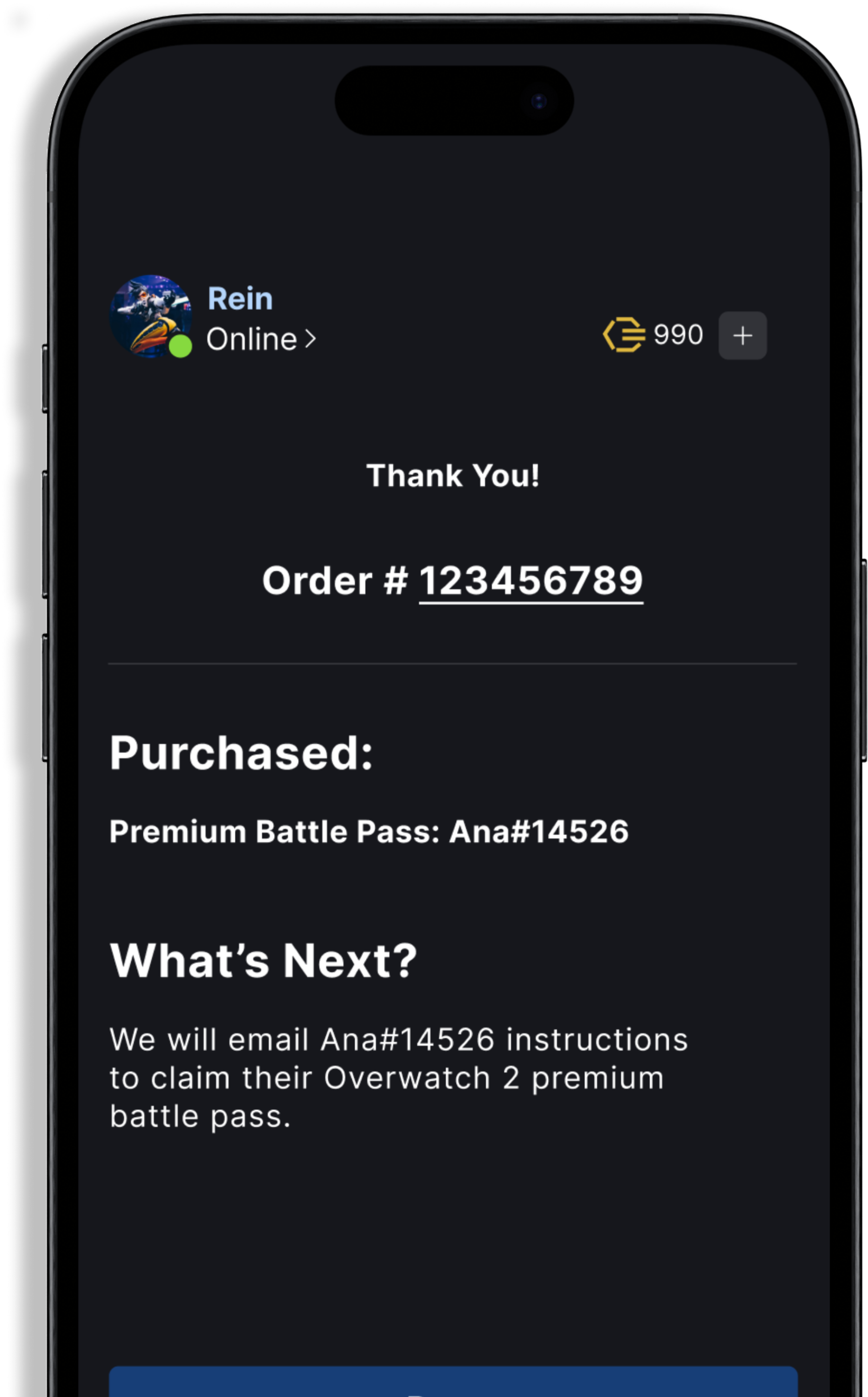
Confirmation of purchase
Content Library
Here, I included the logo, color schemes, buttons, icons, and typography. I took multiple screenshots of the Battle.net app, and copied the colors used. This way, I would not add any new colors or create an unbalanced color scheme. The font I used is Inter, as it seemed to be the closest style font to what is already used by the Battle.net app. Most of what is in the content library, is already existing within the app. This will create familiarity to those who are already use to the battle.net app.
Usability Test Results
After creating the prototype, I conducted a usability test with 5 male participants aged 19-35 who regularly play games and use the Battle.net app. This demographic aligns with our target audience, ensuring their feedback would be directly relevant. While the overall response was positive, with users finding the added feature both effective and user-friendly, one participant noted the battle pass selection process as being somewhat confusing. Within the survey, I learned that 60% of the participants found it easy to purchase a battle pass as a gift. In the added response, someone mentioned the purchasing of the battle pass UI being confusing. Although it was still a part of the official app, it made me think of ways to redesign the screen.
Conclusion
Embarking on my first foray into feature development for an existing app, I targeted Battle.net, driven by my passion for the gaming community, particularly Overwatch. While the process presented a learning curve, this case study provided invaluable insights into the crucial steps required for future projects. Creating wireframes emerged as a particularly engaging aspect, while crafting user and task flows proved to be the most challenging element.


